Title Design Blog
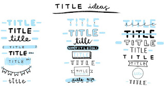
Depending on the genre of the subtitle, we intend to employ different fonts for our title designs. We will use an online source to actually choose our fonts. That website that we used to find our fonts was www.dafont.com.There will be a distinct clip for each title. The font that we used for the Name of Studio and Name of Production Company was “Brush Action”. We'll use the font "Anger Styles" for the actors' names. For each name, three titles will appear. We want to utilize a bold, large font for the film title to make the name stand out. We'll utilize the "Chopsic" font for this. We'll use the font "Headliner No. 45" for the Music By and Edited By titles. We'll also use the typeface "Headliner No. 45" for Produced By.
We'll use the same typeface for the next three titles. Also we’re probably gonna use different colors for the titles. We’ll decide on what colors we want to use after making the titles. To display the titles, we intend to use a variety of transitions. We’ll figure out what kind of transitions we want to use after trying some out. One of the transitions that we’re thinking about is a fade in. Another transition that we might use could be the title appearing after the first scene is shot. Another way we can shoot our title is by having the title appear once Stephen is in a forest scouting. We may discover new strategies and ways to insert the titles into the film once we begin editing.


Comments
Post a Comment